Sunday, January 30, 2011

Chinatown Shoot

Yesterday, I went for a Chinatown CNY Shoot with TXY SYD! <3
It was a very personal experience for me, shooting Chinatown like never before,
since it was raining, it was at night and it is considered a rather bold action of me.
I often worried and cared whether others might mind if I shot them,
and thus I never went forward with boldness.
Yesterday's group shooting really made me want to continue shooting people.
In a candid manner, even if it takes me to snap some shots, "despicably" without them knowing.

Honestly, I'm not someone who frequently goes out.
But doing something with a group of fun enthusiasts really spurred me on,
it will and definitely is something that i would love to do.
Even if i meant for me to be drenched like yesterday
(Shooting with an umbrella is not impossible, but still rather tough for me. Haha)


Here are photographs I shot yesterday:

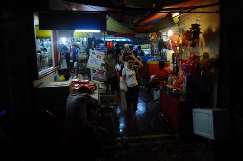
There was a huge crowd yesterday, people wanting to get into the joyous atmosphere of the New Year. There were interesting sights for us to see as well! Firstly, the rubbish which were like speckles of snowflakes on the floor. Secondly, the synchronized action of people bending down to walk through the crowd- to avoid the 'bumps' on the tent (gi-enormous rain puddles) in case a mini heavy downpour comes by your side. And lastly, umbrellas everywhere!


The uncle selling the willows resting here, with a plastic bag above his head. I don't exactly like the composition of this shot, it would be better if it was a wide-angle. But I do like its subject. The willows as background and the light bulbs as spot lights, makes the picture rather atmospheric-looking.


I like to take photographs using low light, during the night and when there is a luminating main light for focus on. Such as the one above. The dark backgrounds, comprising silhouttes and umbrellas contrasts with the red tent and the light. Perhaps, it would have been better if I adopted the rule of third?
And for the shot of the girl, this is one of my favourites for the day. It was unexpected shot and I was glad I snapped it just in time. Her backview, with her pose and her pink clothes. One tinge of regret, if I possibly might, change the shutter speed to capture the rain drops she was trying to catch.


For this orange shot, argh; it might have been better if i focused on the subject on the front. This is debatable. I could either capture the old lady selling the oranges at the back, or the lady picking the oranges. But i do like the composition and the lighting for it.

The lights were shot from a shop. They are beautiful.
Illuminating the dark background like light drops.
Traditional chinese masks further emphasizes the chinese environment as well.
I would have possibly bought a sky lantern yesterday if I could stop by.

There were some seniors playing chess there. I would have possibly cropped them, but I hadn't. It would be nice if they were captured by film, on black and white.


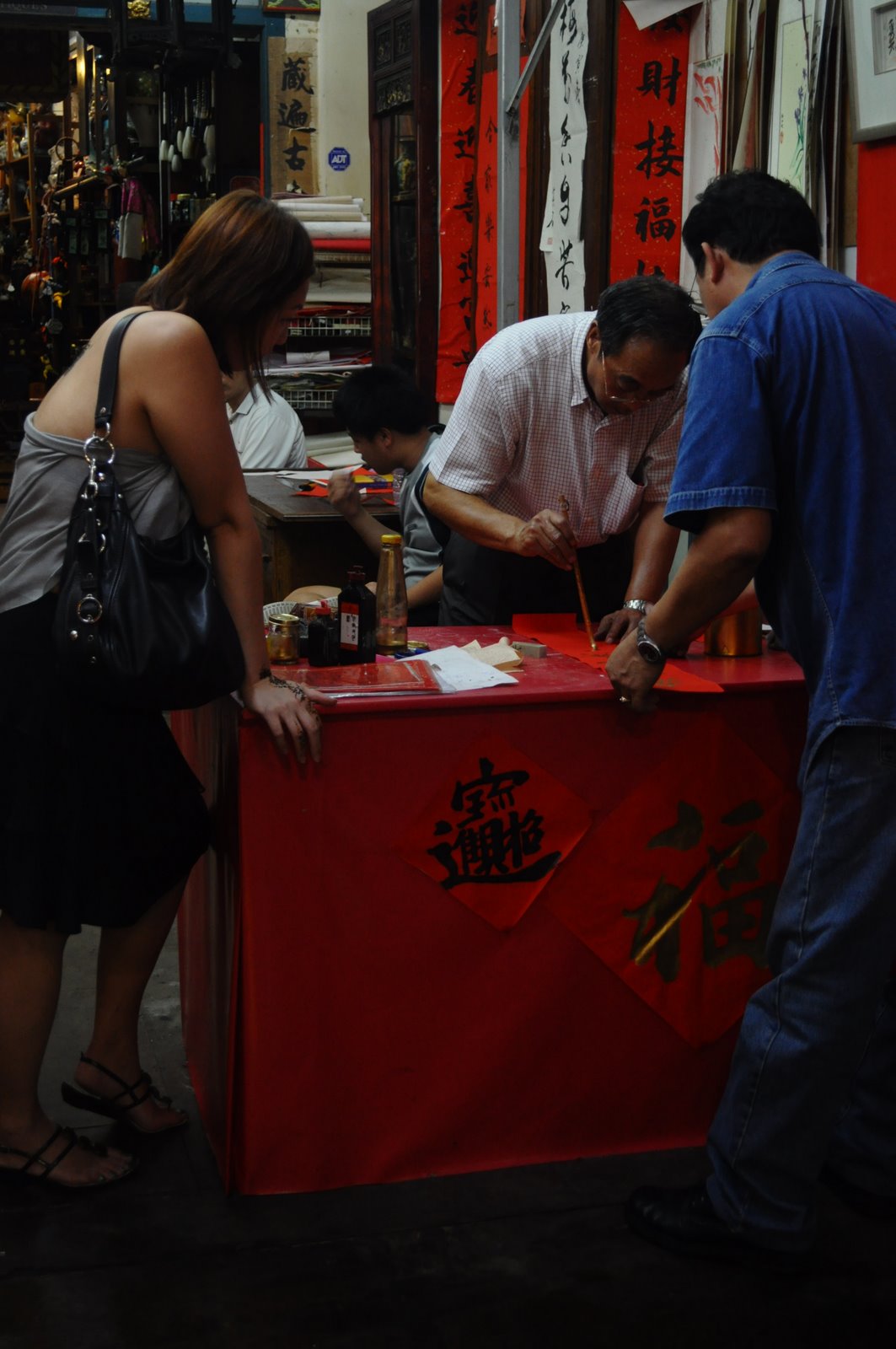
The chinese traditional envrionment fully portrayed here. The chinese calligraphy, reds depicted and chinese words. I like the lighting, once again- low light. Would it have been better if it was wide angle?

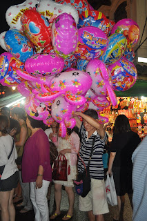
The uncle selling the balloons. He doesnt really like us snapping him, so it is a rare shot of his half-shot face. He was attempting to cover his face, I suppose. But the balloons in his hands really make the shot interesting. Wide angle, better? (argh, I'm too into wide angles- all my other perspectives of the photographs are in wide angle!)
Shadows, of the chinese traditional ribbons. How beautiful they are!
It's the first time shooting outdoors, with a group.
Just with the intention to capture, don't think and snap, wait with patience for my image to appear.
The feeling's awesome. And this won't be my last outing!

Thursday, January 27, 2011

When things could actually relate to the arts


Today, on a learning trip, I went to the Kranji War Memorial.
It's been many years since the last time I've been there.
Mixed feelings, is the only way I can use to describe how I feel.
Sadness, lost, admiration and respect.

When everything you ever thought and learnt about the World War sudddenly seemed so close by, when I realised that the war was merely sixty, seventy years ago, when deaths, lifes and relationships seemed so unvaluable under the conflict of two parties who might have became good friends if not for the war, when only names were what left of those whose remains could never be found, when I thought about the fear and unpreparedness of the soldiers who had to face death at such a young age...

"To the world, you are one. But to us, you are the world", a message carved at the bottom of one of the headstones. How true this is, for the families who waited for their loved ones to return, but they never will.

I was rather emotional today, when faced upon impactful sights and realizations:
Firstly, the Kranji War Memorial, designed by architect Colin St. Clair Oakes, made me sentimental. The war memorial was designed such that all three arms are being acknowledged- the navy, the army and the air-forces. The tower with a star on the top represents the navy, to depict a submarine's conning tower. The wings and the thirteen walls represents the air-forces and the army respectively. Wings to depict that of the air craft, walls to depict the columns of the army marches. It was sloped upwards, where headstones are set in a geometric pattern along the long narrow terraces in the big plot of land just under ground level, allowing it to be kept straight. Each column having about 20 headstones respectively. Despite the many years that have passed, the memorial is still immaculately kept, retaining its finest and purest beauty. Not only does it deliver a sense of serenity, it also makes one feel peaceful and sound.

The design of this war memorial not only shows simplicity, purity, but also brings forth an important meaning behind the entire architectural structure. The three different arms-the navy, the army and the air-forces- that have come together to protect and serve as one. The architectural design also displays a sense of solidarity as well. Simple lines, simple geometrical shapes put together, and a cleverly use of space; the Kranji War Memorial is portrayed to be neat, tidy and spacious.

Secondly, this trip made me wonder about the issue of "identity". Many times, I had wanted to explore the theme of self-identity in various of my works. To me, identity was important. It represented who I was, who I am, what I felt towards myself. By exploring self-identity, it was like a struggle to find out the truth behind who I truly am inside. It was a necessity. But today, I saw many headstones, with inscriptions such as "A soldier of the 1939-1945 war, known unto God". These soldiers who were buried in the Kranji War Memorial could not be identified, and thus meaning that only God knows who they really are.

It made me realise how insignificant one may be. So much for self-identity. I always wanted to be different from others, unique in my own special way. Individuality was essential, for I didn't simply want to be anyone in this world. I wanted to be me. However, through the trip, it somehow made me rethink over things. Self-identity is important, but nevertheless, identifying yourself being part of the world is of even greater importance. Sometimes people often forget that their world is not made up of only the four walls they live in, the environment they stay in, but rather a bigger world. A larger truth. For when everything else is being ripped bare, self-identity is not something that would hold to stand.

Perspectives are often greatly differing, changing in accordance to what we experience and see. What I may be thinking right now may not be what I continue to believe in tomorrow. It's unexpected, but not necessarily in a negative manner. It is like chance, something we can't control or change. Just as like art, sometimes we are just having our mind blocks; or it might just be our good day. Inspirations for art are like such as well, putting down your art materials, talking a walk may just do the job. Perhaps, the next time, when i consider about the ideas behind my art pieces, i should step out of my world and look it from another varying viewpoint.
My perspectives may differ as well.

Thursday, January 20, 2011

Tee designs

Here are some 2D design that I have worked on for my CCA (track and field):

This is the first tee design done for my CCA. It is that of a photograph display hanger made of a string and some clothes pegs. Photographs which imitates polaroid with the different Nanyang athletes in their events, signifying the instantaneous moment of joy or happiness. There are also '1st' medals and an Asics spike shoe (the most common shoe brand used by Nanyang track athletes) seen hanging from the line.


This is the latest track and field tee design. For this work, I mimicked the pop art style, with the use of the broad colour planes and polka dots. The base colour of the design is blue, and thus with the use of more reds and yellows, so as to not clash with the blue. Some geometrical shapes are used in this design, to focus more on the elements I would wish to portray. In this case, the three figures seen: running, throwing, jumping. These geometrical shapes also help to frame the figures together, presenting a neater and more concised image. The use of a typical font, the one which is often associated to those on the tees of highschool cheerleaders. Not forgetting the lightning bolt shape that is used to put all the shapes and figures within. It represents strength (throwers), agility (jumpers) and quickness (runs) which is often related to track and field.
Drawing pen, A4 sized

This is the other design, a personal project for NYLD (Long Distance). It is for the event category that I specialise in. The silhoutte of a female figure running represents the typical nanyang long distance girl (like me) running. With the silhouttes of the different trees mimicking the trainings that we often carry out at MacRitchie Reservior. Not forgetting the fact that I personally do love trees a lot. For them being natural, steadfast and simply beautiful in its way. There are also reasons for drawing six trees; 1-sec ones; 2-sec twos; 3-sec threes, 4-sec fours; 5-coach; 6-assistant coach(es). Adjoining the design beneath are track lanes, each having exactly eight track lanes (the norms). Besides training in the MacRitchie Reservior, we do often train on tracks at Hwa Chong Insitution, CCAB or National Junior College as well since we still do track events. On the track lanes which are interwined together, small figures may be seen running on them too. The purpose of the interwining lanes was to represent the long distances that we do in a literal manner. Giving rise to the tagline beneath the lanes, "we clock our mileage". The words, "NYGH LONGD" can also be seen above the lanes.

Felt pen, A5 sized

This design was done last year for the track and field sec fours graduation. Its purpose was simply to give it to the graduating sec four seniors in appreciation of their efforts. It is an invitation card for our sec four farewell celebration. Despite the fact that they already know of this annual celebration, the invitation was done in any case. It was a suggestion by a sec four senior to make this celebration more formal, and at the same time interesting. The pop art style is once again used for the design, with the broad colour planes and polka-dots. Rectangles are used as well. If you realise, the colours used are generally the primary ones, excluding the green, biege and pink which added afterwards to enhance the design further.

This simple design brings in the idea of the number tag that athletics pin onto their jersey for cross country or track events. There is no specific reason for the number '0001' chosen, rather to make it simple and illustrate the idea of a our track team as "first". This design does not need complex drawings like those presented earlier but uses more typography designing elements such the fonts, size and also the positioning of fonts (see the made up logo next to the school crest).
This is one design made last year, which I personally am not quite satisfied with. Firstly, I did not use much effort in producing this design, and thus resulting to a lack of profound meaning or effort behind this piece. Secondly, it is not desirable to put the speech bubble next to the figure. Even I myself am not aware of the reason behind placing that speech bubble there in the first place. (?) But nevertheless, I do like the square shapes in which the various places which we train at are placed into. It helps to give a sense of coherence to the picture and also helps to make the design neater. And I do like the idea of placing the girl over these places, holding onto them as if they were her friends. It seems to show that the girl immerses herself in her trainings, which gives her the smiles on her face (joy). And, it seemed as if the girl reigned over these trainings, as if they were her territory. Like she knew them so well.

As time progresses, I am enjoying more and more of designing work. Previously, all I thought about designing tees were boring and simply that (nothing interesting). But well, I was wrong. Who says that artworks can't be tshirt designs? Who says that tshirt designs have to be all words and nothing special to speak of? Google 'tee designs' and one finds a lot of intriguing ideas which could and already can be found printed onto tshirts. It made me realise that more quality drawings too can be translated from the paper onto tshirts. There are no restriction boundaries and it leaves it for one to express themselves through the design, which ought to be attractive, meaningful and special. And in my case, it speaks of the people who are wearing the tee.

Wednesday, January 19, 2011

Interesting product and furniture design

I have always been interested in product and furniture design and today I chanced upon this product design website on accident. I was totally fascinated by the intriguing designs that were possibly thought about by the the product designers. Like people, products are often packaged on the outside in order to appeal more consumers. But who says that product designs are boring and dull? Like clothes, they come in various designs and patterns. It not only is interesting, it also makes us wonder aloud how these designers are able to come up with such brilliant designs (!)


See that short tagline "Clean your plate or whatever you want/ Kitchen sponge"? This is a simple design of a sponge (top) that is packaged to mimic cheese being sold in a supermarket. But though simple, it never fails to bring smiles onto one's face.This design reminds me of Taiwanese singer, Gary Cao's supermarket album (bottom) not long ago. It is interesting to bring the design element into our everyday life, giving us consumers that tinge of surprize.
This is a series of winter soups packaged into promotional heat resistant cardboard sleeves slotted into existing cups. This though may look plain, and nothing interesting to be talked about, it emcompasses not only the idea behind the design but at the same time helps to transmit the message to its audience. See the pattern of this design? The knitted wool that one wears during winter (when it's cold). It emphasizes on the ability to be able to be resistant to heat, but also on the speciality of the soup-handmade (as indicated on the cup). Likewise, knitted wool conveniently helps to convey this point as well, hand-knitted. How nice is this design!

This design (top) makes use of typography, which makes it simple, easy to comprehend and instantly attractive to one. The size, the colour and even the postition plays a huge difference to the design. In this case, it conveys the message straightforwardly to its audience. Somehow, this design reminds me of the ilford photo paper package (bottom). Perhaps due to the font used, especially the size of it.
This chocolate keeps the idea of braking the chocolate bar into its mini pieces, but in this case into the mini scrabble pieces. There is a similar design in our supermarkets now, not only are they chocolate scrabbles, there is also the chocolate monopoly. Which allows the consumers to play with the chocolate pieces and then allow the winner of the game to eat the delicious chocolate up! Perfect for a scrabble/monopoly-chocolate lover.

This is my most favourite design (designed by a Japanese)! Not only is this interesting, it also helps to bring the message across to its audience too! I guess you would know what this product is, it is banana juice! How appropriate this is! It replicates the real banana fruit onto the product and gives the product a whole new refreshing look. If this were to be sold in our supermarkets, I would definitely buy cartons of them home. How lovable they are! You would too feel really happy when drinking them as well.

All these designs really make me wonder how these designers are able to think of such splendid ideas given the constraints and pressure. Their imagination is just, mindblowing. I want to be like them, designing such adorable products that not only gives them that sense of satisfaction when their designs are being manufactured on the large scale, but also when their consumers smile delightfully at the concept and idea of the design that they painstakingly came up with.